At a glance
The studio’s identity and website
Create a name, identity and website for the studio. Use the web surgery concept to introduce its work, team and process.
DeliveredThe studio launched its identity and website in approximately two months. Projects appear as patients, the team as doctors, and the process as a course of treatment.
- 01
Create the identity with the CEO
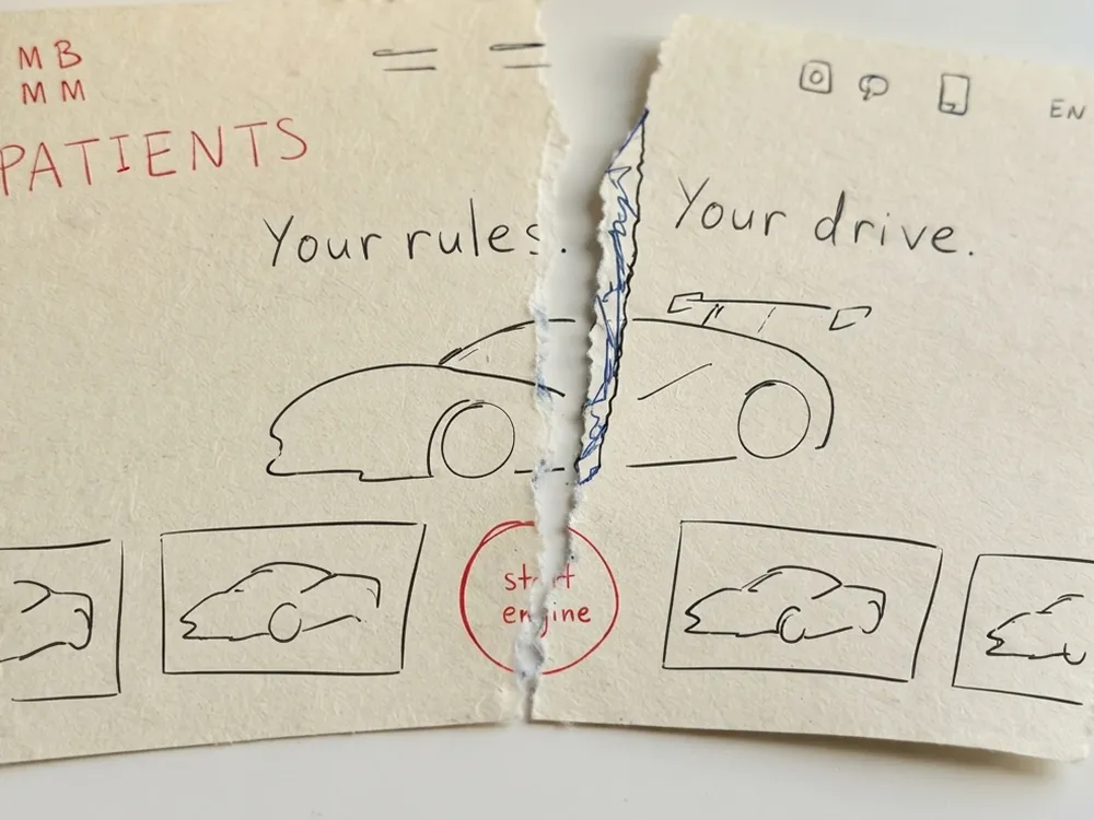
We co-created the name and visual identity. I developed the website concept and explored the lettermark, transitions and portraits on paper.
- 02
Lead nine specialists
I assigned work to two designers, three developers, a project manager, a QA engineer, a motion designer and a copywriter, gave feedback and approved their work. I agreed key decisions with the CEO.
- 03
Review the site before launch
I worked with the team on typography, layouts and interactions, checking the site against the original sketches.
The idea
A studio with a surgical approach.
I developed “web surgery” to explain the studio’s work. Websites become patients, the team becomes doctors, and projects go through diagnosis, surgery and discharge.
I sketched pages tearing open to reveal projects, portraits coming into focus and treatment cards explaining the process. The team used these drawings to build the interface.
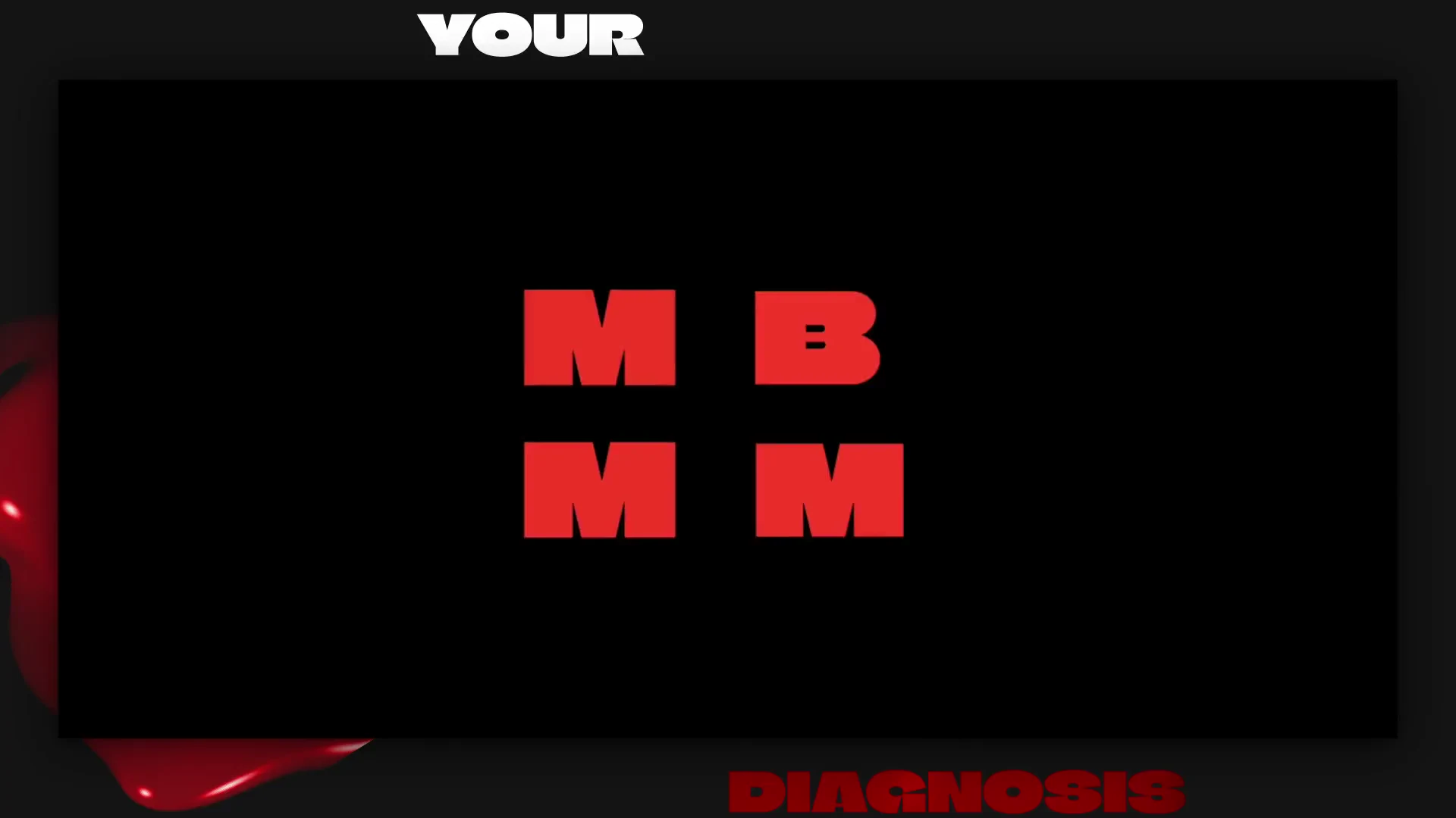
The opening scene / AUTOPSY
From sketch to launch
I explored the lettermark, torn-page transitions and team portraits on paper, then directed their implementation with the studio team.
The experience
Inside the website.
Patients
Pages tear open on scroll to reveal the next patient.
The team / Doctors
My team card says “Plastic Surgeon / UI”, following the medical theme. On the project, I was Creative Director: I developed the concept, gave feedback and approved the team’s work.
The process / Treatment
A stack of illustrated cards explains the process through diagnosis, surgery and discharge.
Multilingual design
The website in 24 languages.
I led the team’s work on typography, layouts and interactions for 24 language versions, including Japanese, Korean, Simplified Chinese and Traditional Chinese. We adjusted the layouts for different scripts and text lengths.
- Language versions
- 24
- ENEnglish
- RURussian
- DEGerman
- FRFrench
- ESSpanish
- PTPortuguese
- ITItalian
- TRTurkish
- UKUkrainian
- PLPolish
- NLDutch
- SVSwedish
- RORomanian
- CSCzech
- HUHungarian
- DADanish
- NBNorwegian Bokmål
- BGBulgarian
- SKSlovak
- FIFinnish
- JAJapanese
- KOKorean
- ZH-CNSimplified Chinese
- ZH-TWTraditional Chinese
Selected interface previews